In the last two posts, I’ve explained and demonstrated the process for configuring customized branding for your Office 365 and Azure Active Directory login experience to give users a company branded experience when accessing Office 365 applications. Once the user is logged in, we want to ensure that, that company consistent branding identity resumes so in this post, I will be covering just that in how to brand your Office 365 Tenant Portal and Apps and just to reiterate, this is free for all Office 365 Tenants and you don’t need to be on a particular plan or SKU to access this.
In the last two posts, I’ve explained and demonstrated the process for configuring customized branding for your Office 365 and Azure Active Directory login experience to give users a company branded experience when accessing Office 365 applications and extending that experience for international non-English users. Once the user is logged in, we want to ensure that, that company consistent branding identity resumes so in this post, I will be covering just that in how to brand your Office 365 Tenant Portal and Apps and just to reiterate, this is free for all Office 365 Tenants and you don’t need to be on a particular plan or SKU to access this.
To start, we need to login to the Office 365 Admin Center as a Global Administrator. You can access the Admin Center at https://portal.office.com. If you haven’t ever applied any branding to your Office 365 Tenant, then it will probably look something like the following image.
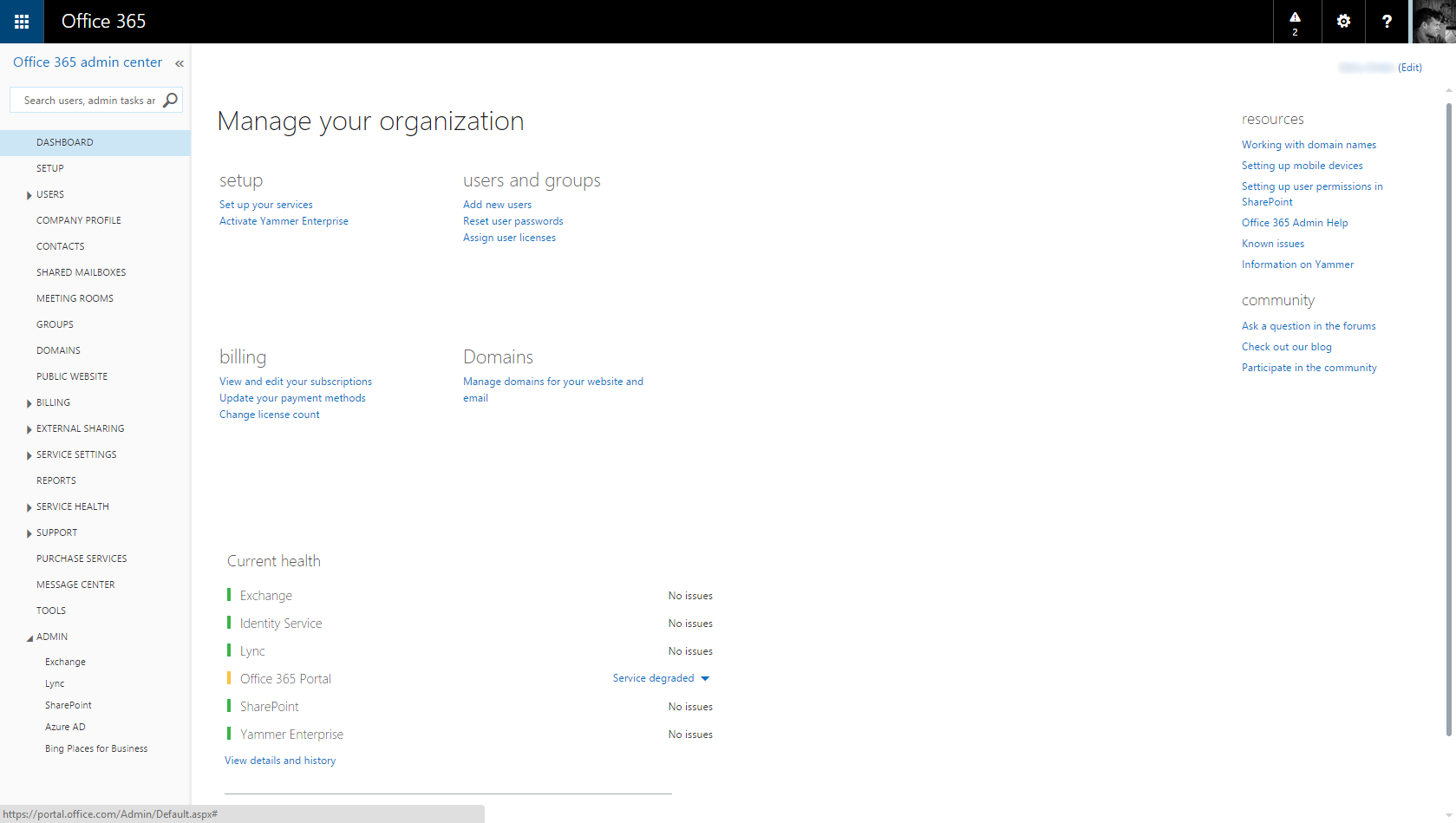
The default branding uses a blue accent colour which is used for the clickable App shortcut button in the top-left corner and is used to colour the page body text. The default header colour is black. To change the branding, click the Company Profile link in the left navigation bar in the portal. This will take you to the page where you configure your company name and address etc. Once on this page, there is a link in the left navigation for Custom Theming which you want to click.
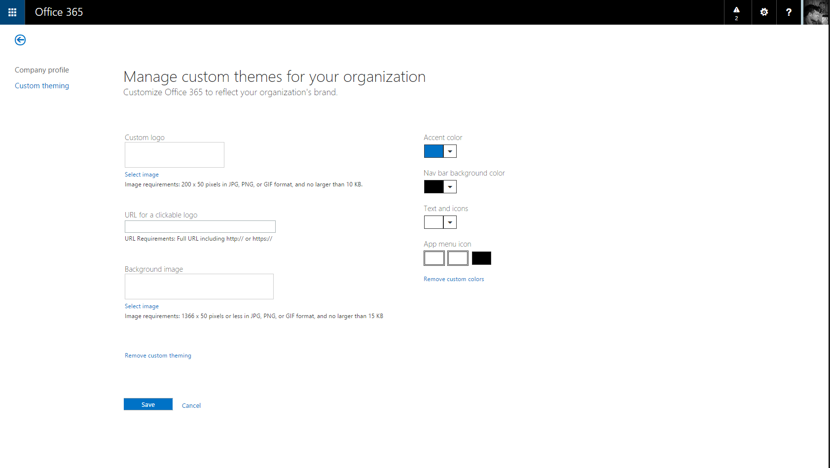
On the Custom Theming page, you can see there are several options for applying your branding to the portals and apps in Office 365. Custom Logo does what you would expect by allowing you to add your company logo to the pages. URL for Clickable Logo allows you to add a hyperlink to the company logo perhaps to direct people to your SharePoint Online intranet site or to your public website.
Background Image allows you to apply an image to the background of the header. If you use a gradient effect header or a patterned image on your public website, you could apply this here to give a consistent look and feel across your internal and external facing portals.
To the right, we have options for Accent Colour, Nav Bar Background Colour, Text and Icons and App Menu Icon colours.
Accent colour is the colour used for the app shortcut icon in the upper left corner of the Office 365 sites and apps and is also used to colour hyperlinks and buttons on the pages. Nav Bar Background Colour applies to the Nav Bar if you have not applied a background image and applies to the whole bar except for the shortcut icon in the left corner. The Text and Icons colour applies to the title shown in the navigation bar along with the buttons in the upper right corner of the portal next to the user profile picture. Lastly, App Menu Icon applies to the tile like icon used in the upper left shortcut. If you use a light accent colour then you many want use the black option for this icon, otherwise the other option is white.

One you have applied your colour and icon selections, click the Save button to apply the changes. The changes will be visible in the Admin Center straight away but they will take a little time to appear in other Office 365 sites and apps. I had to wait about 15 minutes for my Tenant sites and apps to reflect the changes.
One observation I made is the placement of the company logo in the navigation bar appears to be dead centre. To me this looks very odd and in other blogs and instructions I have seen online showing this process, their logos appear in the left corner. Suspecting it to be IE in Windows 10 Technical Preview at fault, I tried a Windows 8.1 machine using IE and Chrome with the same results. I’m not sure when this changed or why but needless to say, it looks odd to me so I’ve opted to remove the logo from my final implementation for my tenant but your results will vary.
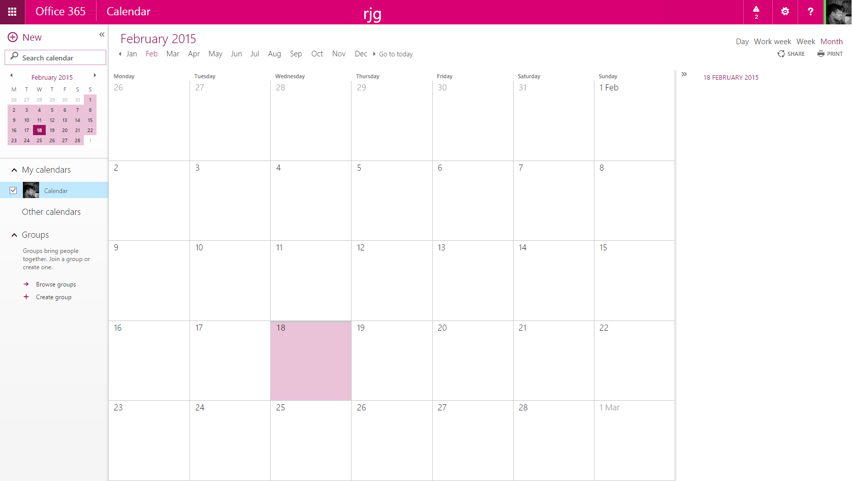
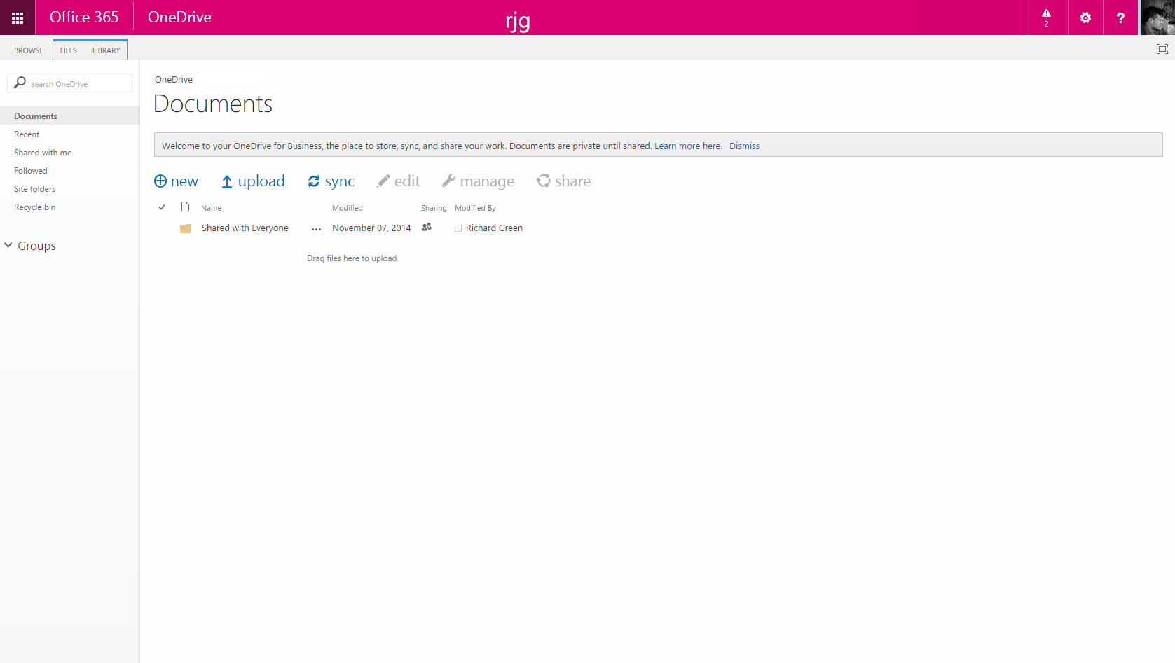
One you have given it some time for the changes to be applied across Office 365, here is how is looks in some of the user facing sites.
One thought on “Company Branding for Office 365 Apps”
Comments are closed.